Dry Effect
logo design / brand development
The Problem:
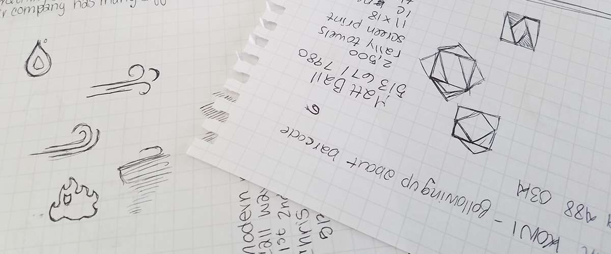
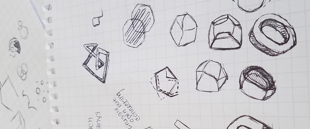
Dry Effect was growing and rapidly expanding their business. They needed visual organization to convey their different offerings and after almost 15 rounds with their previous designer, they weren’t happy.
The Solution:
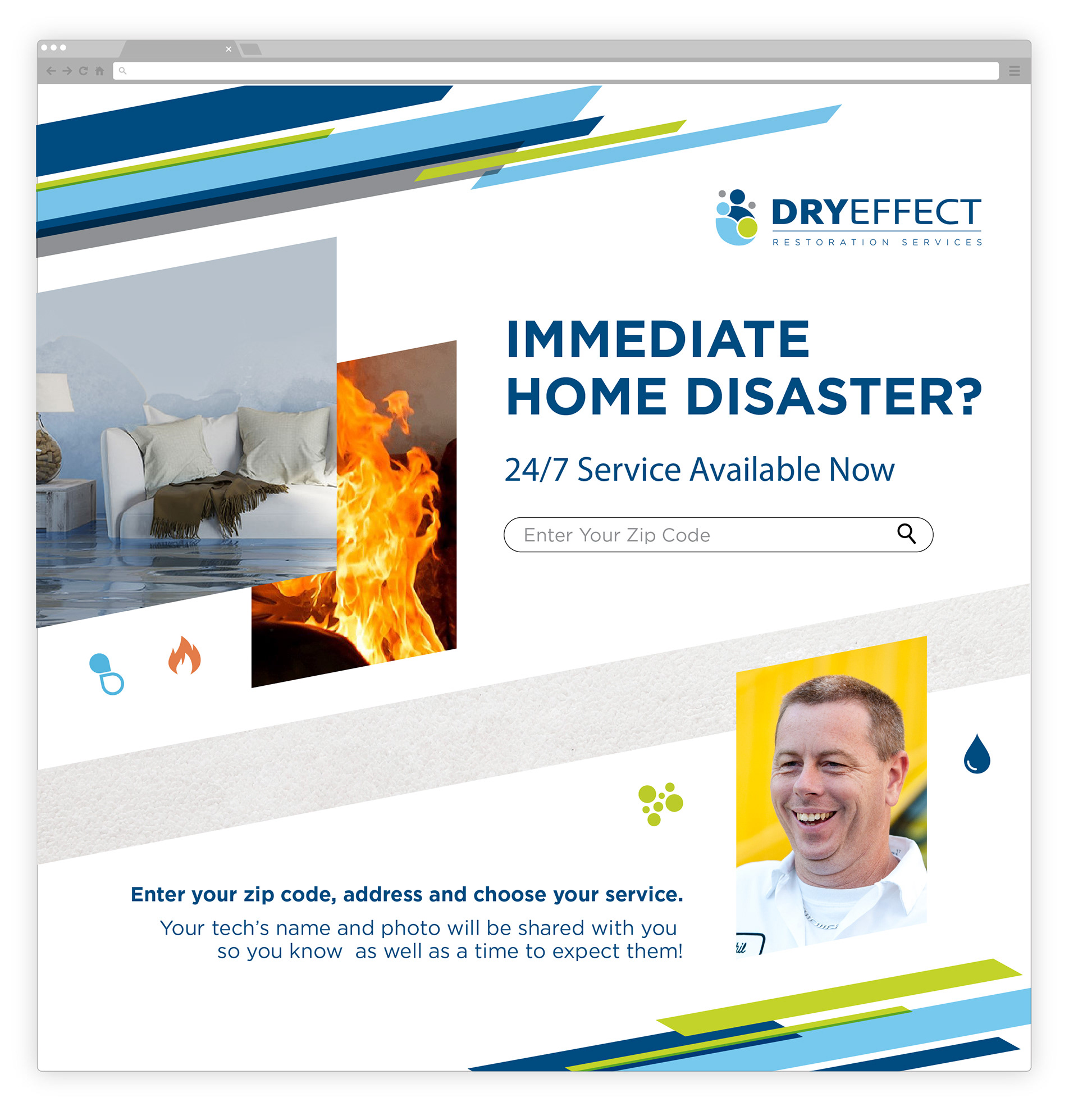
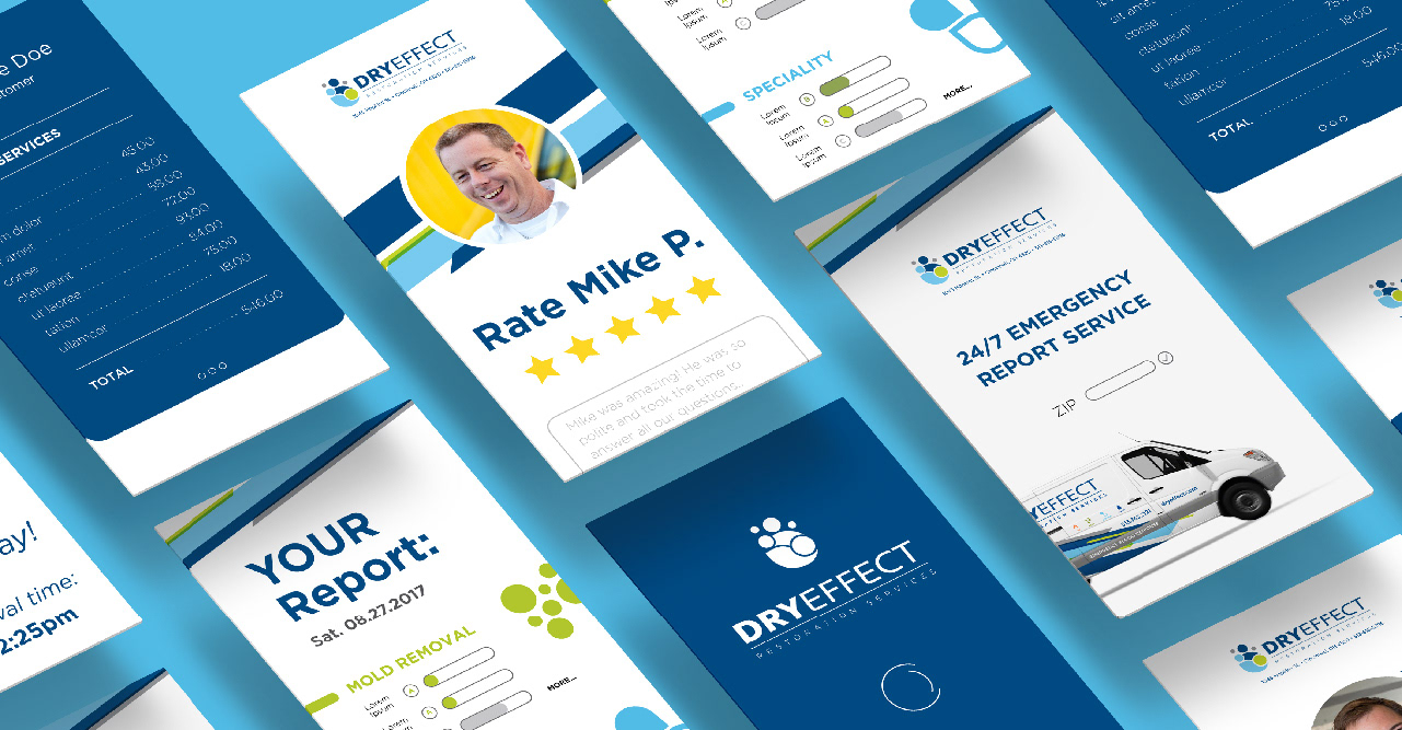
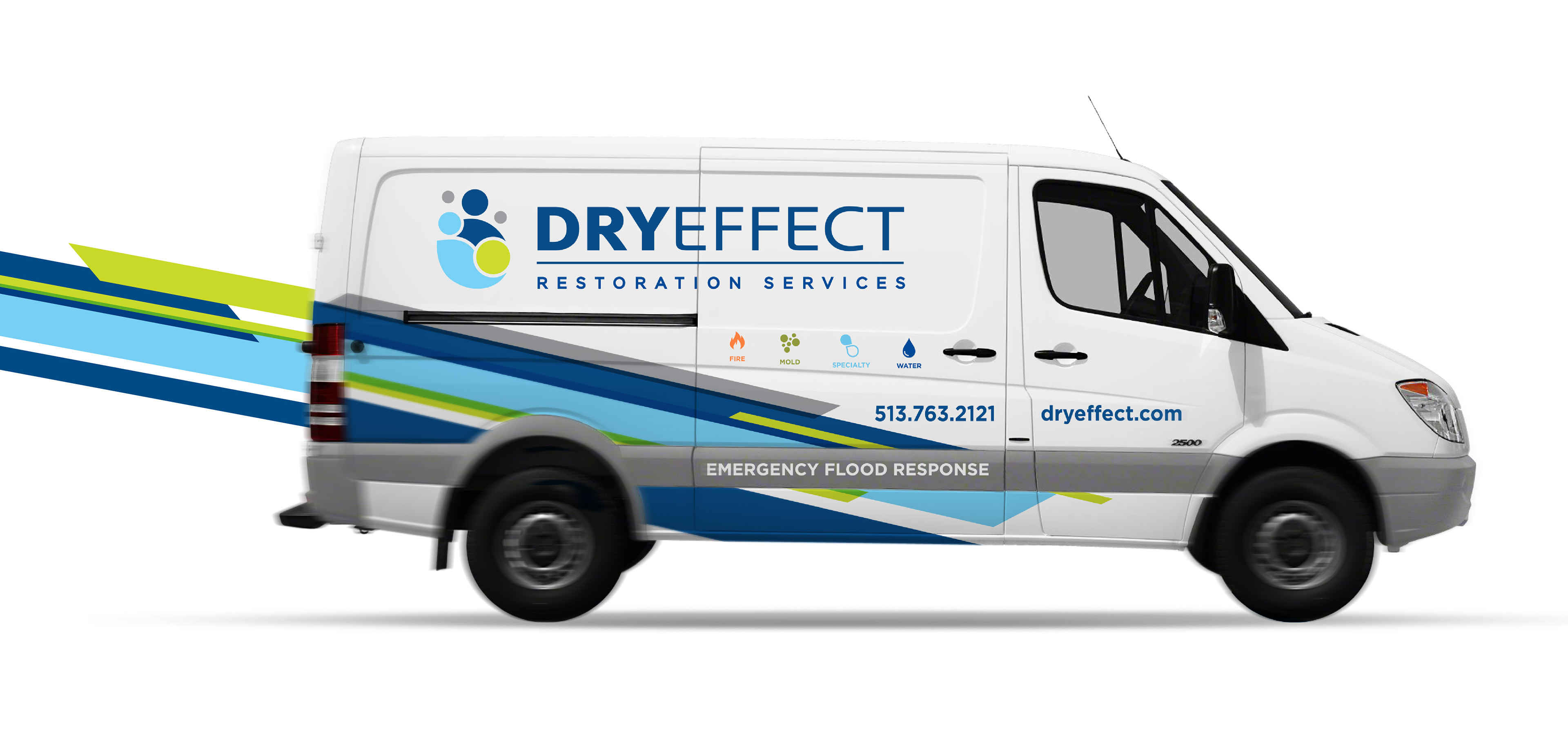
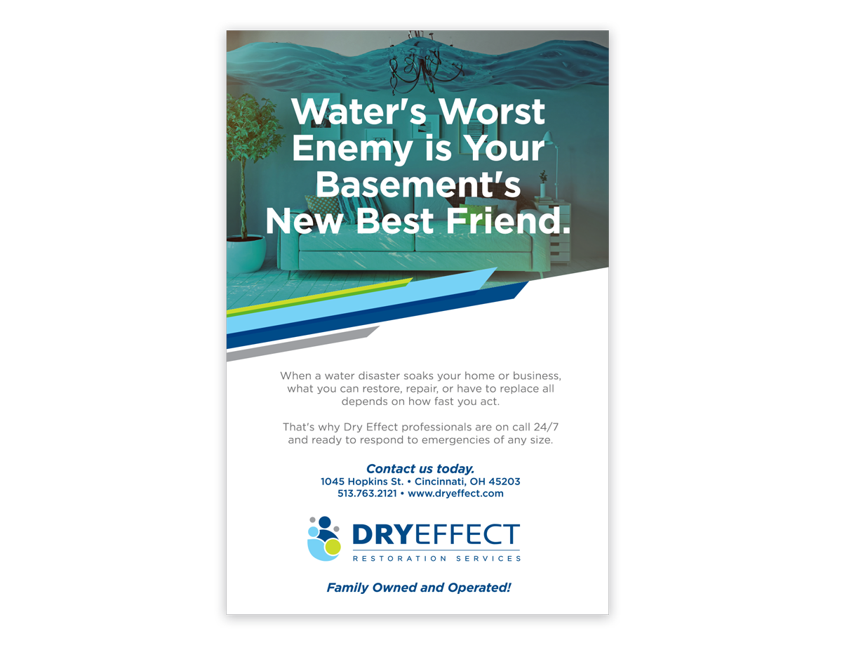
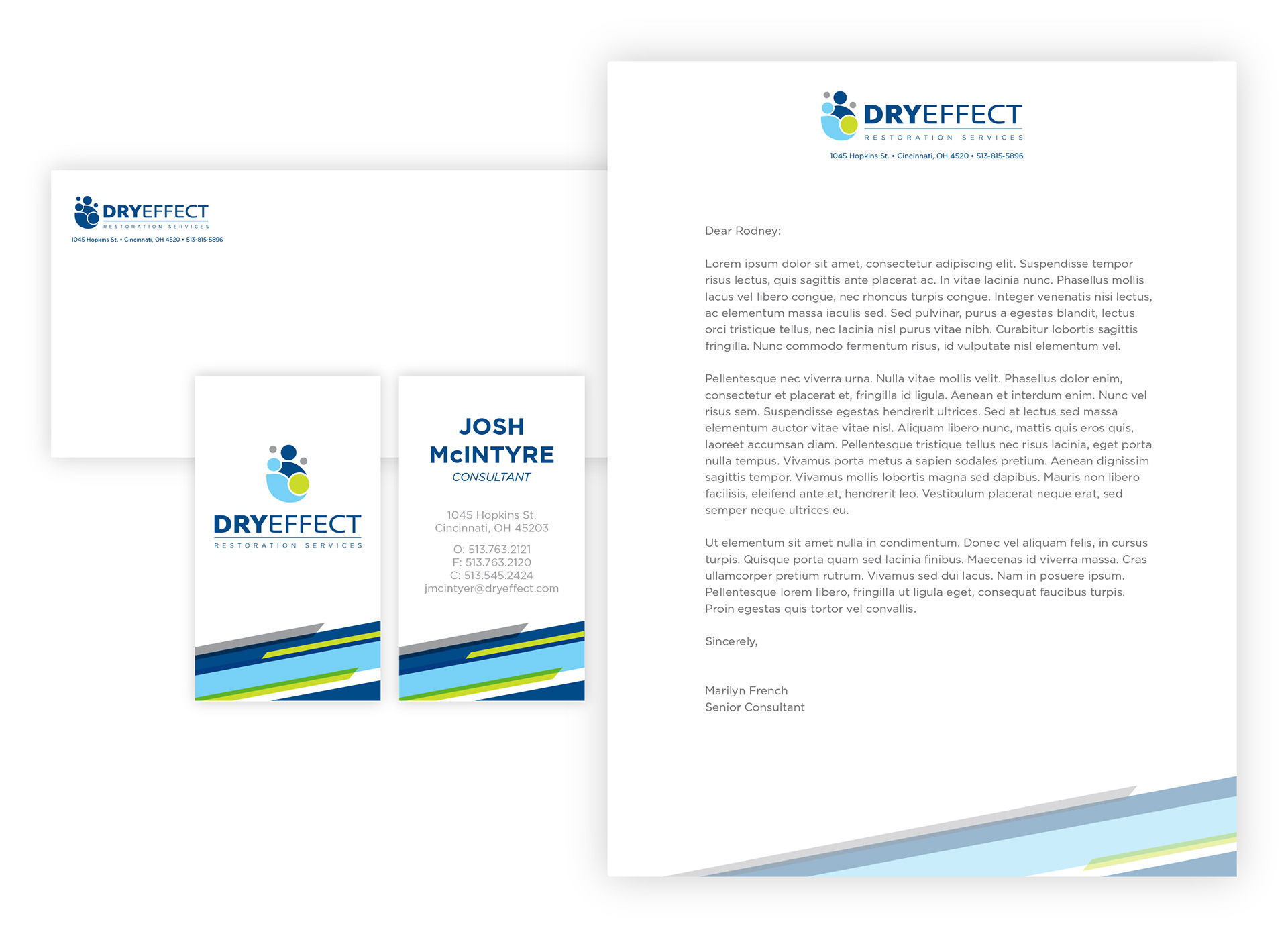
After speaking with the owners, what became clear was Dry Effect’s amazing commitment to the customer. This dedication inspired a logo concept centered around helping individuals and families.
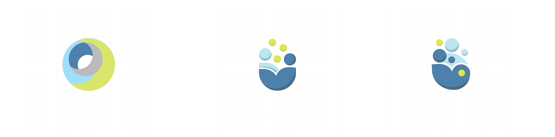


The graphic system contains a rigid shape structure that provides an eye-catching contrast to the logo. Its fresh and clean personality is trustworthy and approachable with a touch of lighthearted whimsy in its photography. At a time when a homeowner is stressed and desires a tidy outcome, the Dry Effect brand promises a reliable job well done.