FitSecret
UI UX design / logo design / brand development / motion graphics
The Problem:
The existing ‘FatSectret’ app lacks goal setting and motivation while primarily concentrating on calorie tracking alone.
The old FatSecret’s clunky design did not provide a clear user path and left the user feeling overwhelmed with little guidance. Many of these users stop using the app altogether instead of focusing on small lasting changes.
Often times users lose motivation with traditional apps, which means losing ad revenue or subscriptions. Changing your lifestyle is no small feat, and it takes numerous small changes that add up to big ones. This brand evolution and app redesign provides a holistic solution that keeps users working on all their goals, health and otherwise.
.
The Solution:
This re-imagined design of the popular Fatsecret app, is now referred to as FitSecret. The name has more clear and positive intention while suggesting a secret to share.
The new user interface now concentrates on user flow, creates an emphasis on daily goal writing and visualization along with small group accountability. The app records when you hit or miss your selected goal events, and visualizes your stats in real time for you and your group.
The written measurable goals, short daily mindfulness training and user accountability help keep you motivated in your lifestyle and habit changes while not feeling overwhelmed.
The app concentrates on facilitating these daily tasks, which are backed with research to help you achieve your short and long-term goals, heath and otherwise.
The Research:
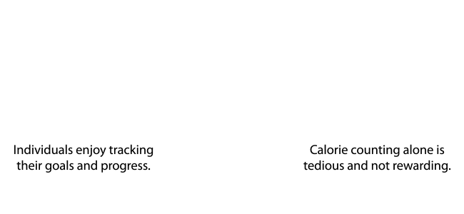
When starting the project, I researched and created a survey of common issues that people run into when starting and staying with a lifestyle change. Using Reddit, Facebook and friends and family, I solicited a survey using both multiple-choice questions and open-ended questions. After gathering the responses, I digested the results and discovered some key points.

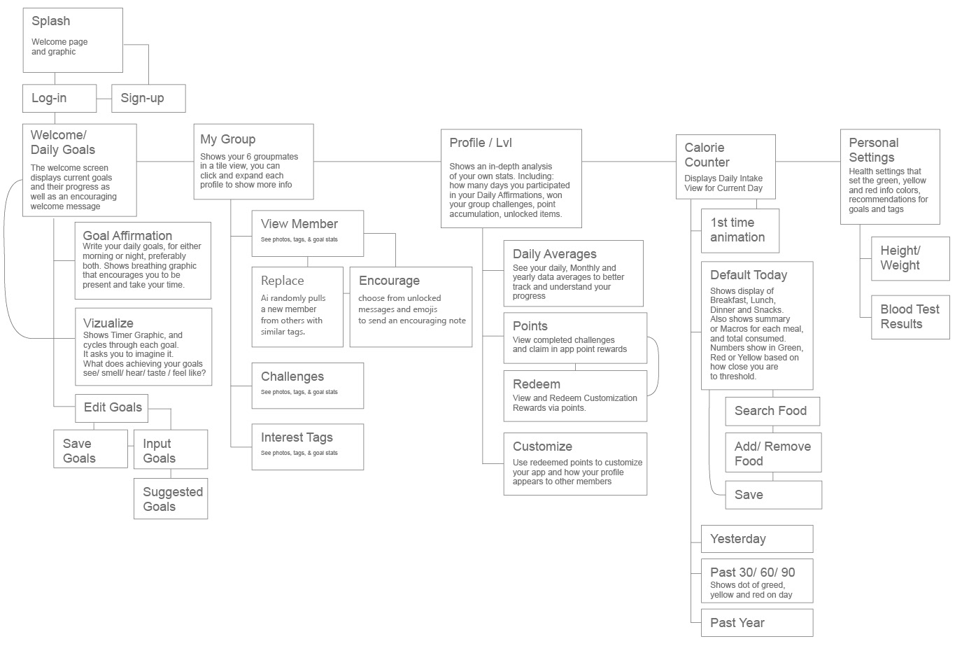
User Flow:
Below you can find a User Flow that will guide the Wireframing and structure of the app. Creating the User flow makes it easy to see the scope of the project and deduce how many screens will be needed. At this stage, sharing work with collaborators is simple and leaves the freedom for quick changes.
Wire Frames:

User Testing:
The next step was to test a low fidelity prototype among users in the targeted age range (29-39). By using heat tracking plugins and observations, I tested the design both remotely and in person. I asked the testers to talk as much as possible when using the prototype and compiled their pain points and things that did not quite make sense to them. Using their feedback, I incorporated the revisions into the next iteration of the app.
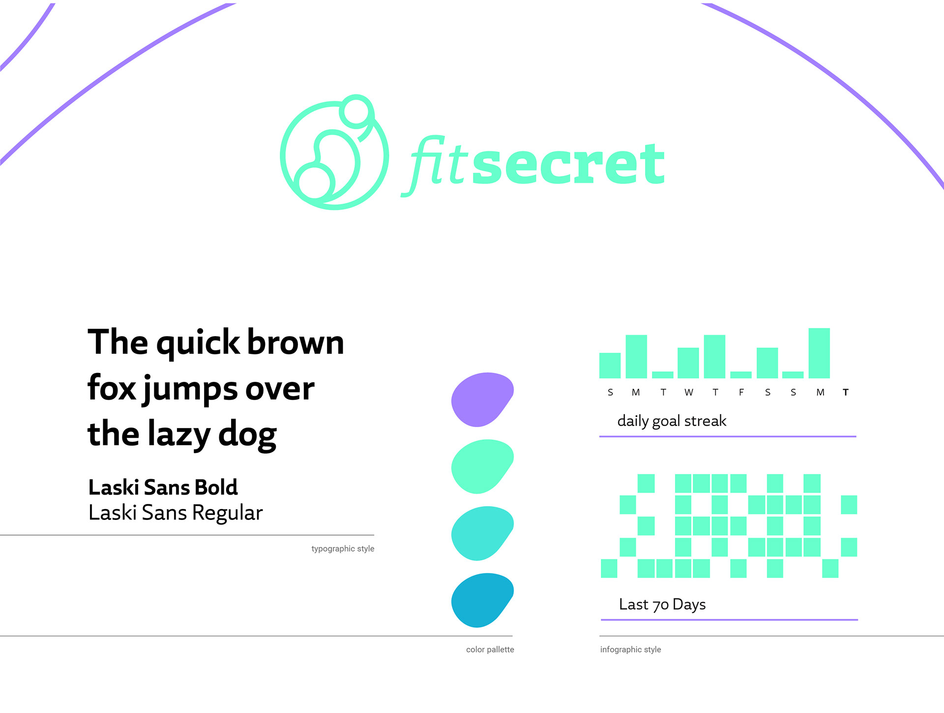
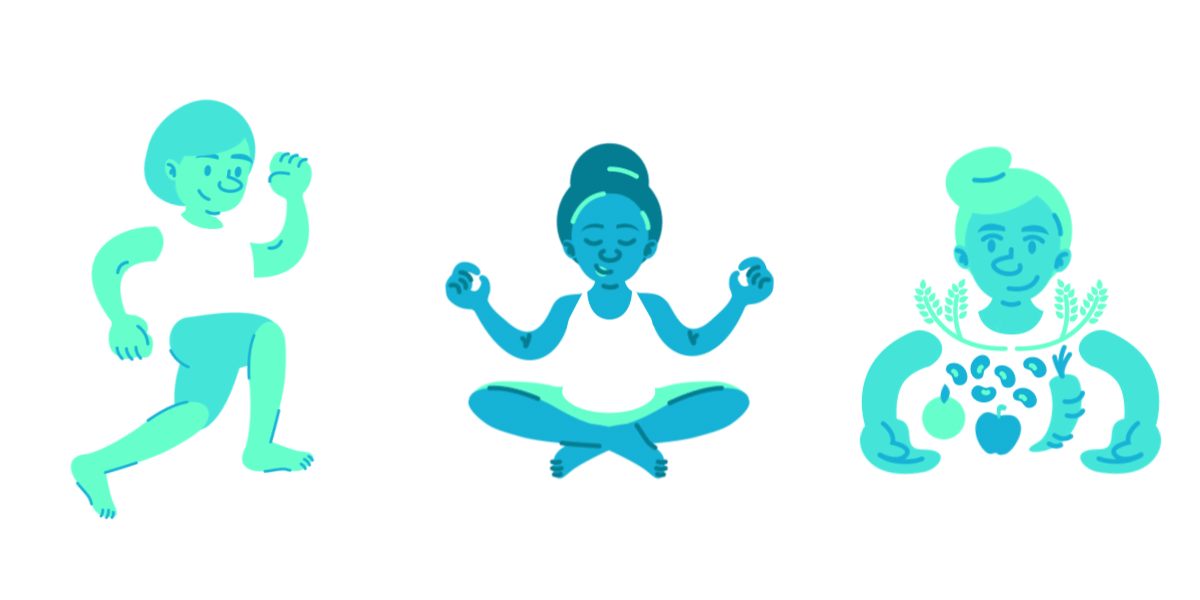
Visual Identity:
The new brand identity of the app concentrates on energy. From the bright colors to the organic lines inspired by action, the new FitSecret uses an electric green to shock the senses. An incredibly legible typeface brings practicality to the design, while the illustrations create an inclusive atmosphere. User personas generated in the research stage inspired the build-your-own avatar idea.
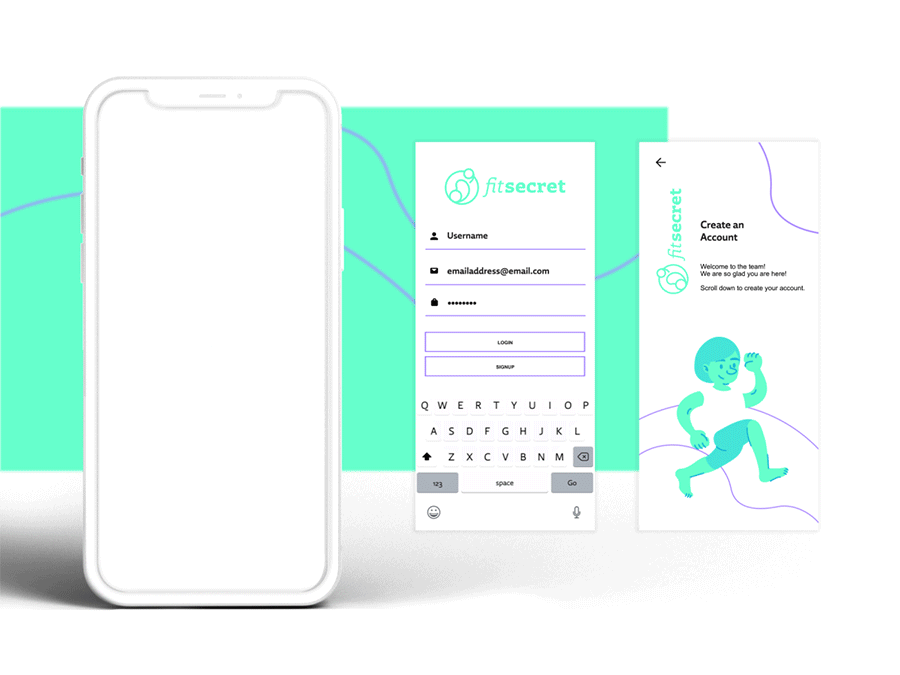
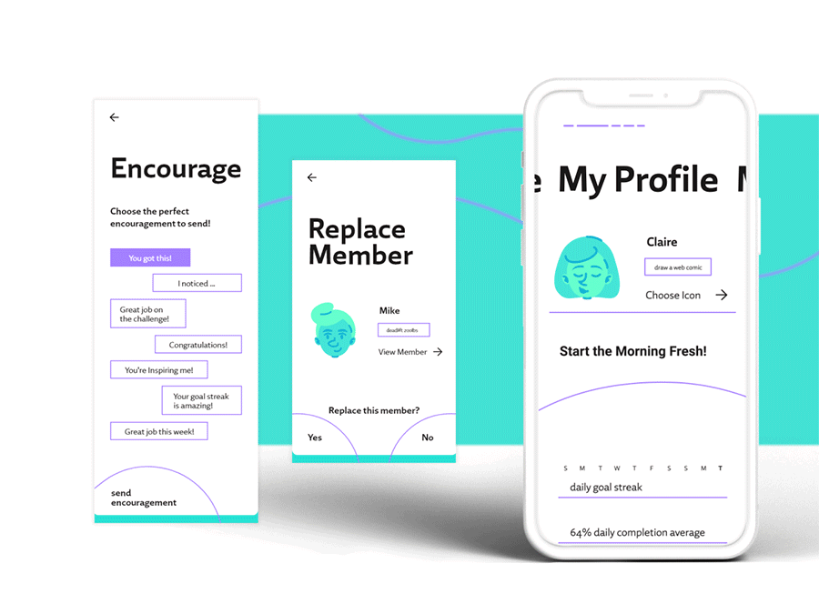
Key Moments: Login & Sign-up
Pinpointing Key Moments for the user provides a basic structure for the app. It gives the interface a more modular system and directly correlates to the user flow.
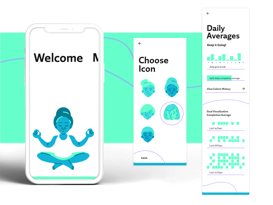
Key Moments: Visualize and Affirm Goals
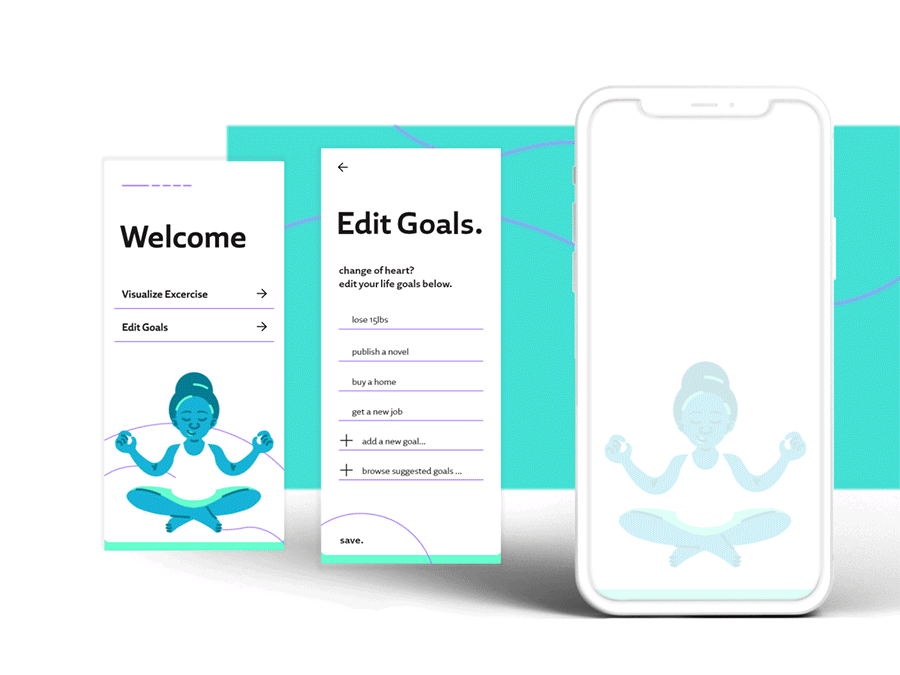
Key Moments: View and Edit Goals
Key Moments: View Group & Join Group Challenge
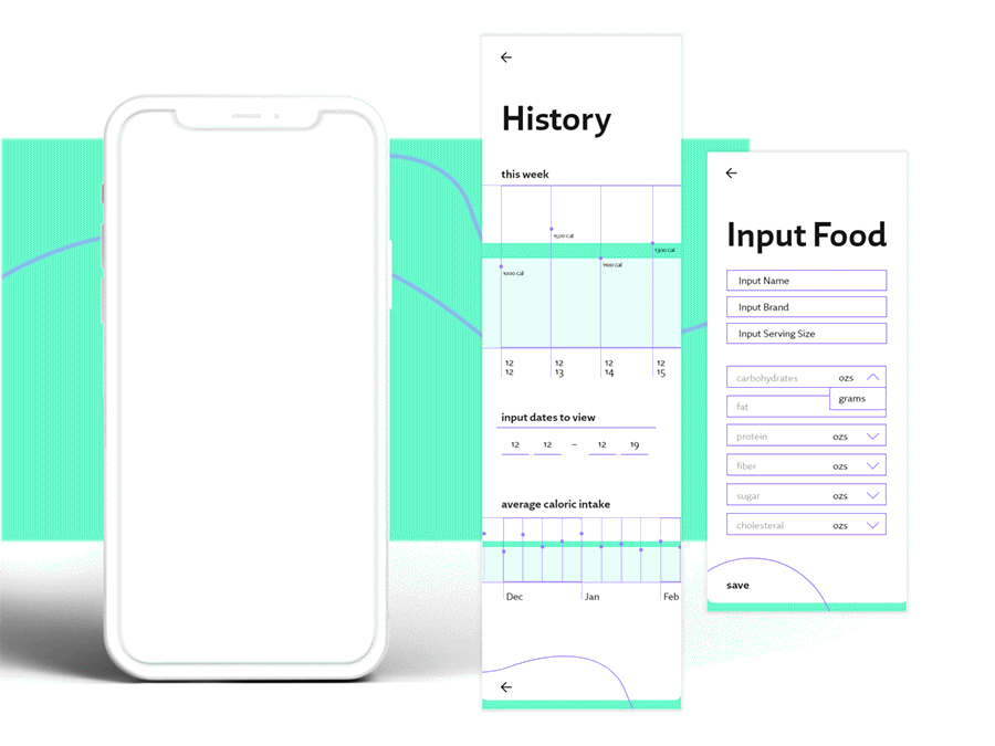
Key Moments: Search and Add to Food Diary
Outcome: Deliverables & Summary
Deliverables:
Designed, tested, and fully animated screens illustrating the user flow through key moments of the app. A logo, graphic system and illustrations give a unified look, tone, and feel. The simple, vibrant colors add excitement to an otherwise tedious task.
Designed, tested, and fully animated screens illustrating the user flow through key moments of the app. A logo, graphic system and illustrations give a unified look, tone, and feel. The simple, vibrant colors add excitement to an otherwise tedious task.
